2011 is going to be a banner year here at Backpackingmatt.com. As I explained in my January Update, I have a number of exciting initiatives planned in the coming months.
Each of these will ultimately result in a travel blog that is more beneficial to you – the budget conscious traveler or backpacker.
I’ve spent the last fourteen months working off this more-or-less unaltered Thrilling Theme. It’s been fantastic. Cody of Thrilling Heroics developed a user-friendly and slick looking theme – I’ve loved it, yet I’m ready for some changes.
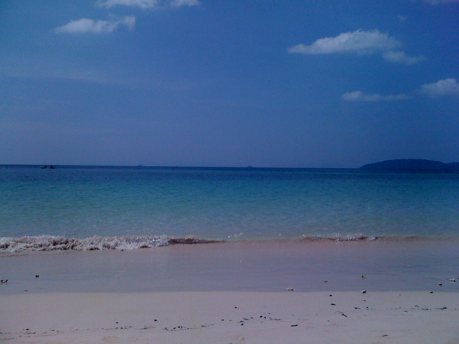
First, you’ll noticed a newly designed header. This design focuses on Backpackingmatt.com’s tagline:
Life’s a Journey
While much of Backpackingmatt.com‘s archives are filled with my experiences and my travel advice, it’s my intention in the coming months to open this website up to your travel experiences and your travel advice.
The result? A travel blog that more effectively lives up to its moto:
Exploring the Unknown and Offering Travel Advice, Inspiration, and Ideas to the Budget Conscious Traveler or Backpacker.
I’m currently talking with a couple writers who are interested in joining Backpackingmatt.com as paid contributors – if you’re interested, please contact me.

Second, you’ll notice on the front page of Backpackingmatt.com I’ve added a featured post slider. I’ve been wanting this for some time – and many thanks (and virtual beer) go out to Chris of TheAussieNomad.com for helping me make this dream a reality.
This allows me to feature posts from my archives that very often get missed by new visitors to Backpackingmatt.com.
Lastly, I’m currently producing Backpackingmatt.com t-shirts that feature part of the new design from my header. I’m excited to wear my brand, and it’s my hopes you will be too.
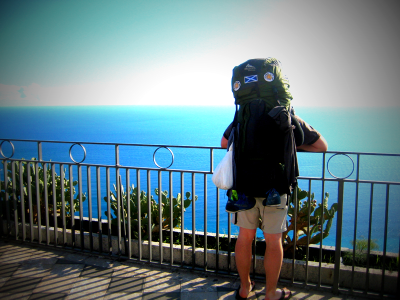
It’s been almost four years since I fell in love with backpacking and experiencing the unknown and the tagline “Life’s a Journey” rings very true to me. Throughout my journey I’ve met unforgettable people and been exposed to unbelievable scenery.
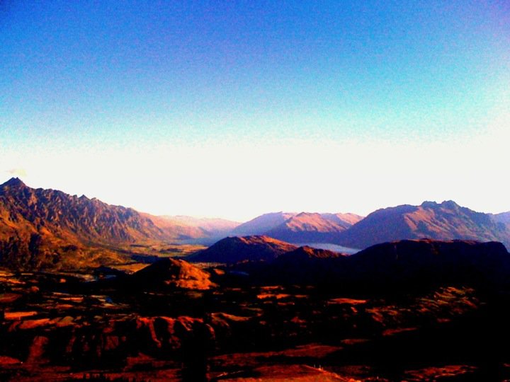
The journey has taken me to some of the world’s most beautiful places – yet there is still so much to see. If you can relate, you might just want a Life’s a Journey Backpackingmatt.com T-Shirt.
To get things started, I’ll be giving away one t-shirt (with postage paid to anywhere in the world) to a randomly selected commenter on this post.
Simply leave a comment below – your thoughts on the new design, why you’d want a shirt, or perhaps your feelings on living your life as a journey – and I’ll be announcing the winner on the Backpackingmatt.com Facebook Page on Friday, March, 11th at 12:00PM – New Zealand time.
Happy Travels,
(Backpacking)Matt
‘Life’s a Journey
The header was designed by Griffin of TheTravelingDesigner.com – he was fantastic to work with and I’m over the moon with the final product we created together.

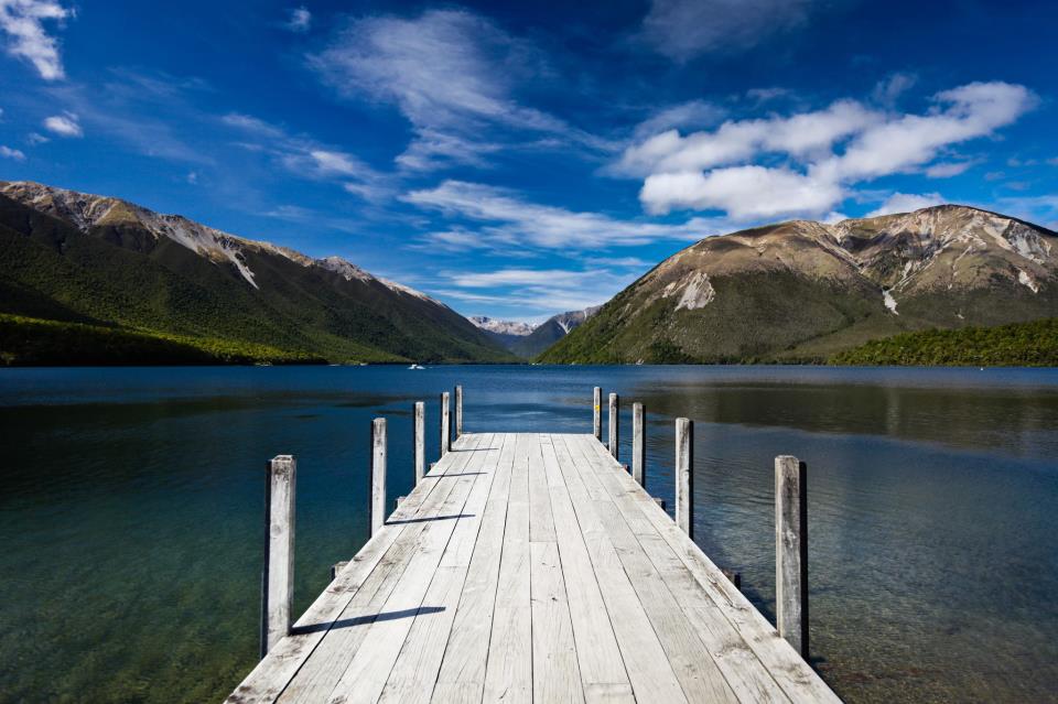
 Backpacking Matt




Looks good mate and can’t wait to see what you have comeing up for us all this year
@Chris Thanks mate for all your help! Glad you like it!
@Lauren Thanks! Good luck planning your trip!
@Laura Cheers!
I absolutely love the new banner – It looks fantastic! 🙂
Life is indeed a journey. And one not to be wasted in a cubicle 😉 The site looks great!
Seriously. That new header is fantastic! (this, from a likewise digital graphic designer) Amazing how you managed to get all that “Exploring the Unknown and offering…” blather so nicely tucked in at the top right. Honestly – very well done!
Oh and my thoughts on “Life’s a Journey”? Indeed, with 6 decades of a travel’n life under my belt (and prepping to continue the journey by moving lock, stock and barrel to some g-forsaken rice paddy in Southeast Asia come October), uh… yup, I’d have to say that the “Journey” verily NEVER has to end!
@Dyanne Thanks heaps for the compliments — means a lot coming from another designer! I can’t take credit for the work, Griffin from TheTravelingDesigner.com did the work for me – he was great to work with! Exciting about your move to Southeast Asia – where are you headed?
Really loving the new header, Matt! It really sets a nice tone for the site. And I also like the new featured posts slider… I’m really a fan of those. They give you so much flexibility!
I never thought of T-shirts before… but that’s actually a brilliant idea! Whenever you (or anyone else) wear it, that’s like instant free advertising. Awesome.
@Amanda Glad you like it, thanks for the feedback. I’m excited to be releasing the t-shirts, and yes – even if no one else is interested, you can sure bet I’ll be sporting them around New Zealand!
Looks fabulous matt…inspired! I am in the process of redesigning mine too..must be something in the air. Good luck on all your adventures this year!
@Charu Good luck with your redesigns – glad you like the new look!
Congrats on your new and updated site! I really like the look and “feel” it. It flows well and the new banner is really sharp looking~
Mia
Love the new banner and the featured post on the front page is a great idea, I want to do something similar on our website – but it’s on a looooonnnnggggg list of to do’s right now.
@Kirsty Thanks — I’m stoked to have the featured post slider, I’ve been wanting one for ages!
@Annie Cheers for the comment and RT! Glad you dig it.
@Garreth Cheers mate — good luck planning your trip.
It looks great Matt! I’m excited to see what’s coming up as you continue your journey!
Banner looks great Matt and looking forward to what you have instore for us this year. Keep up the great work!
Banner does look good – but has no one else noticed unknown is spelt unkown?
@Mike Wow, thanks — getting that sorted now!
Matt, I think your site looks amazing! It’s classy and very professional…I agree that the design of the header just looks fantastic! Fitting that description on the right of it was quite an accomplishment!
It’s so inspiring to read about other nomads’ travels, for me. My husband and I are working towards that lifestyle ourselves, and while our adventure is a few years off (I’m going back to school for Photojournalism), we still feel compelled to immerse ourselves in the community and learn as much as we can from folks like you who are already doing it!
Thanks for all you share and again, your new look is fabulous! Happy and safe travels to you:)
@Stephanie I appreciate the feedback! Glad to hear you’re finding inspiration from the travel blog community – it’s a fantastic group of people to immerse yourself in. All the best planning for your own journey!
Mate! Great new look. Really loving the Tagline… can’t imagine how you came up with such a catchy well thought out little line myself 😉
Post me a T-shirt will ya? Would wear it with pride!
@Dave I remember the day you suggested the tagline – it was a rainy, cold day on New Zealand’s West Coast and I’m pretty sure we had just finished scrubbing toilets and shower trays. A journey?! I’d say! All the best mate.
Looking good!Its so inspiring to see some travel bloggers who constantly keep up the good work and make a real success out of their blog. I’m looking forward to seeing what your new writers have in store for us!
@Monica Thanks – it’s a work in progress for sure, but I love it – as I’ve said many times, being involved in the travel blog community makes it worth it if nothing else.
@Fran Cheers … a cafe in Iquique, Chile … sounds fantastic!
Admiring this from a cafe in Iquique, Chile. Looking good mate.
Love the new header! Very snazzy look.
I am loving the new header and totally agree that Chris aka The Aussie Nomad is pretty much the best guy ever.
@Ayngelina Yep, he’s as good as they come – has helped heaps in the last couple weeks. A right philanthropist!
@Griffin Thanks man – we got there!
@Cailin Let’s make a meet-up happen. Let me know when you’ll be in Auzzie and I’ll try and plan a trip across the ditch!
@Tempo Dulu Believe me, I feel you on that one!
@Paul The slider is fantastic – I’m looking forward to pulling gems from my archives for new readers to see. I love the moto, and have to give credit to “Dave” in the previous comments here. Thanks for the tweet today and good luck with your blog!
Enjoyed working with you Matt and glad that we were able to, together, design a header we can both be proud of. Thanks for recommending me and sharing my site. Glad everyone is liking it and thanks for the encouraging words. Looking foreword to seeing the future updates and following along.
I’m excited to see what you get up to this year Matt and hopefully our paths will cross sooner rather than later!
I’d wear your shirt with pride – I don’t necessarily have a motto figured out yet but I have always been a fan of the quote “The world is a book and those who do not travel read only one page” St. Augustine
It’s always good to have something to live by 🙂
Heres to a great new year!!
Congrats on the new site, Matt! Sounds like an awesome content plan – looking forward to your posts =)
I love the new banner!
Awesome, excited for all the changes and goals you’re planning.
To travel is to open the mind. Just don’t take your girlfriend with you or you might have many rows!
Nice banner. I should do makeup for my site too 🙂
Nice banner – liked your tagline when I first started reading your blog.
A carousel was one of the most important things when I designed my blog – really highlights your work.
Good luck with the rest of your changes – I look forward to seeing them and your future posts
Matt, Congrats! The new header looks great! Hope you have a successful 2011!
GREAT WEBSITE!!!!!!!!!!!!!
Matt, remember when you, Briana nd I saw each other at the Iowa game in Soldier Field just days before taking off? Between the two of us, we´ve probably gone around the world seven times. Here’s to a great and fucntional redesign, you having 1700 more followers than me on twitter and making this all work out for you.
On Iowa…Go Hawks! I don’t know why I added that…
@Cat Seems like ages ago, eh? Here’s to you still living the life in Spain – can’t wait until our paths cross again.
@Dylan Cheers man, glad you’re digging it. The slider adds a touch of class eh? Talk to Chris …
@Michelle I wanted to keep the same color scheme more or less going forward and choose to keep the blue that would have been on the first header. Glad you like it and it wasn’t too much of a shock! 🙂
@Angela Thanks for the feedback – I was going for professional, glad you’re getting it!
Adoring the classy feel of your new design Matt! Slider is looking shockingly good, gonna have a chat with Richo about that me thinks…
The new banner looks great! I love it! I like how it’s a subtle change, but noticeable at the same time. I find it so weird when I go on a blog one day, and found the blog completely changed over night, haha.
Great projects you have, well done, the new banner is beautiful, looks professional and evocative.
Nice touch with the banner 🙂
Looks Great! Awesome new design :]
That is a classy header! I especially dig the font size changes on the right.
The new header looks awesome. Very clean.
Cheers
mike
Looking good, Matt! Digging the text “mashup” in the right corner – great way to quickly brand the site for the common passerby.
Looks great Matt! Looking forward to see what else you have in store.
A fantastic new design Matt, it really does transmit a feeling of traveling, a journey and an adventure. I’m also working on a facelift…should be ready soon 🙂
Oh- I’ll also have t-shirts available!